download excel nya disini S Curve- Project Progress ( baseline-actual)

MS project -What causes over allocation, and manually resolved an over allocation.
• You can find on MS project : in Tools menu –click Level Resources
• Resource leveling is the process of delaying or splitting a resource’s work on a task to resolve an overallocation.
• The options in the Level Resources dialog box enable you to set parameters about
how you want Project to resolve resource overallocations.
• Project will attempt to resolve such overallocations when you choose to level resources. Depending on the options you choose, this might involve delaying the start date of an assignment or task or splitting the work on the task.
• Resource leveling is a powerful tool, it does a few basic things:
o Delays tasks, splits tasks, and delays resource assignments.
• Resource leveling is a great fine-tuning tool, but it cannot replace your good judgment about resource availability.
download sample file for learning : Create Gantt Chart with excel

create gantt chart di excel , membuat gantt chart di excel
create table sesuai sample
block table, insert chart, pilih bar chart (staked bar)
right click dibar chart tsb, pilih select data
click edit yg dibawah legend entries
ganti series name dari duration dgn select data, start (hy pilih cell b1)
ganti series value dgn select data, dgn data tanggal di start ( blok dr atas ke bwah (cell b2:b7)
clik ok
right click lagi, dichart tsb,
select data
add
pilih series name dgn select data, duration (hy pilih cell e1)
ganti series value dgn select data, dgn data duration ( blok dr atas ke bwah (cell e2:e7)
clik ok
muncul 2 warna chart
double click chart yg biru
diformat data series, muncul menu paling kanan, ubahlah fill dgn no fill, dan border dgn no line
abrkadaba, hy muncul gantt chart anda,
selesai bleum lah
click pilih sumbu y,
di axis option, click categories in reverse order, tujuan dibalik yg dibawah menjadi diatas
terakhir pilih lagi di sumbu y, lalu right click
pilih select data
click edit, edit ini yg dibawah horizontal,
ganti select data, ke cell D2:D7
click OK
jadilah gantt chart anda
Unduh sample file: Create simple Project Management Dashboard.xlt dan Simple PMO Dashboard 18june2016
contoh report sederhana:


Create Simple PMO Dashboard
ingat fungsi dashboard di kendaraan anda, ?
percayalah, sedemikian hebat, kencang kendaraan anda, tapi kalau anda tdk bisa melihat tanda di dashboard, utamanya sisa bensin anda,
setebal apa dompet apa, anda akan dihadapkan mogok dijalan tiba2, konyolnya krn tdk melihat tanda2 kehabisan bensin.
demikian juga project, sebanyak apapun sumber daya anda, bila tdk effective, efisien bukannya untung malah jadi buntung,
project digenerate dgn timeline terbatas, ada start dan ada finish, ada target waktu, bila tdk tercapai konsekuensinya adalah over budget, loss opportunity, stress, serta loss confidence
contoh ada di file, yg ingin dicontohkan adlh SPI, utk detail penjelasannya anda bisa lihat tulisan saya diblog ini juga,
anda bikin formula dulu ; di column B, dimana =1-SPI ( ingat nilai SPI, >1 ahead schedule, =1 on schedule, <1, behind schedule)
bila hasilnya negative berarti project anda mundur, behind schedule,
di column B, blok lalu di menu home, pilih conditional formating, pilih data bars, pilih lagi more rules,
format style: data bar
minimum, pilih di type pilih number, value: isi -1 ( minus 1)
minimum, pilih di type pilih number, value: isi 1
dibar appearance, ubah color menjadi hijau ( penanda bagus)
clik ok
jadilah, dan copy ke cell dibawahnya, bisa dgn format painter.
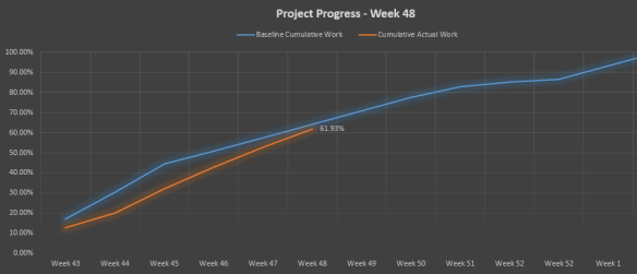
Cara membuat S curve langsung di Microsoft project,
utk konsep s curve: https://thepetshop4u.wordpress.com/2016/05/24/402/
Ini report yg bisa langsung kita generate di MS Project , sumbu y yg dihasilkan adalah waktu ( week, month ,day) bila yg ingin anda tampilkan percentage, silahkan lihat artikel saya yg satu lagi, khusus s curve percentage. ( http://wp.me/p56ONR-2R )
Yg perlu diingat scruve, adalah compare antara actual dengan plan, tujuannya ingin mengetahui progress project anda yg berjalan saat ini : on schedule, behind schedule atau malah lbh bagus dr schedule:
Pada menu reports:

3.Double click graph, muncul field list table , disebelah kanan
Field list, Di work, pilihlah atau Select Cumulative Work ,
Field list, Di work-baseline- pilihlah atau select baseline Cumulative work
Muncul lah seperti dibawah, anda bisa customize sesuai kebutuhan anda.

